Overview
Project Date
Summer 2016
Role
Lead Designer
Responsibilities
Product Strategy
UX Design
UI Design
Prototyping
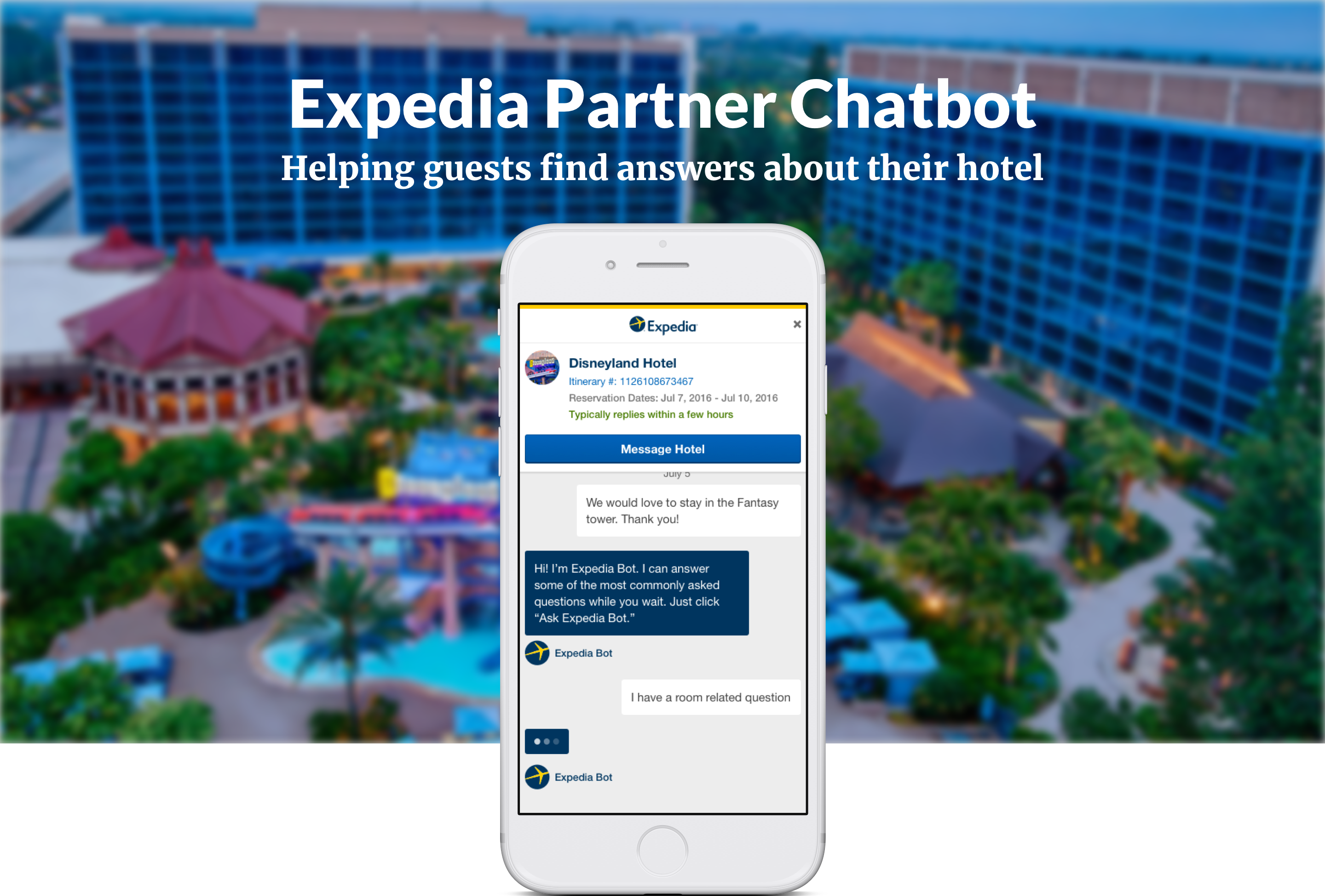
Help guests self-serve answers through a chatbot experience.
In 2016, Expedia Partner Services, a division of Expedia.com that manages the Expedia Partner central platform, where hoteliers upload their hotels, manage their inventory and engage with guests, wanted to help travelers that had booked a hotel find answers to questions they had about their hotel stay. The conversations platform team wanted to build a chatbot experience that would give travelers a way to self-serve finding answers to their questions which would hopefully reduce calls to the hotels and Expedia customer support.
Defining Goals
Collecting data from hoteliers and customer support.
To kick off this project, I met with our product manager to define our milestones, goals, requirements, and scope for this project. We decided that the goal would be to build a proof of concept in 6 weeks and prepare a demonstration for the leadership team to get funding for the project.
The requirements and scope for this project were to build this prototype utilizing a decision tree type chatbot and not jump into AI, and free-form questions – this type of functionality could come later.
Once we had nailed down the project goals and scope, we dove into the qualitative and quantitative data to determine what questions travelers were asking and how often they were asking them.
Decision Tree
Defining the question and answer flow.
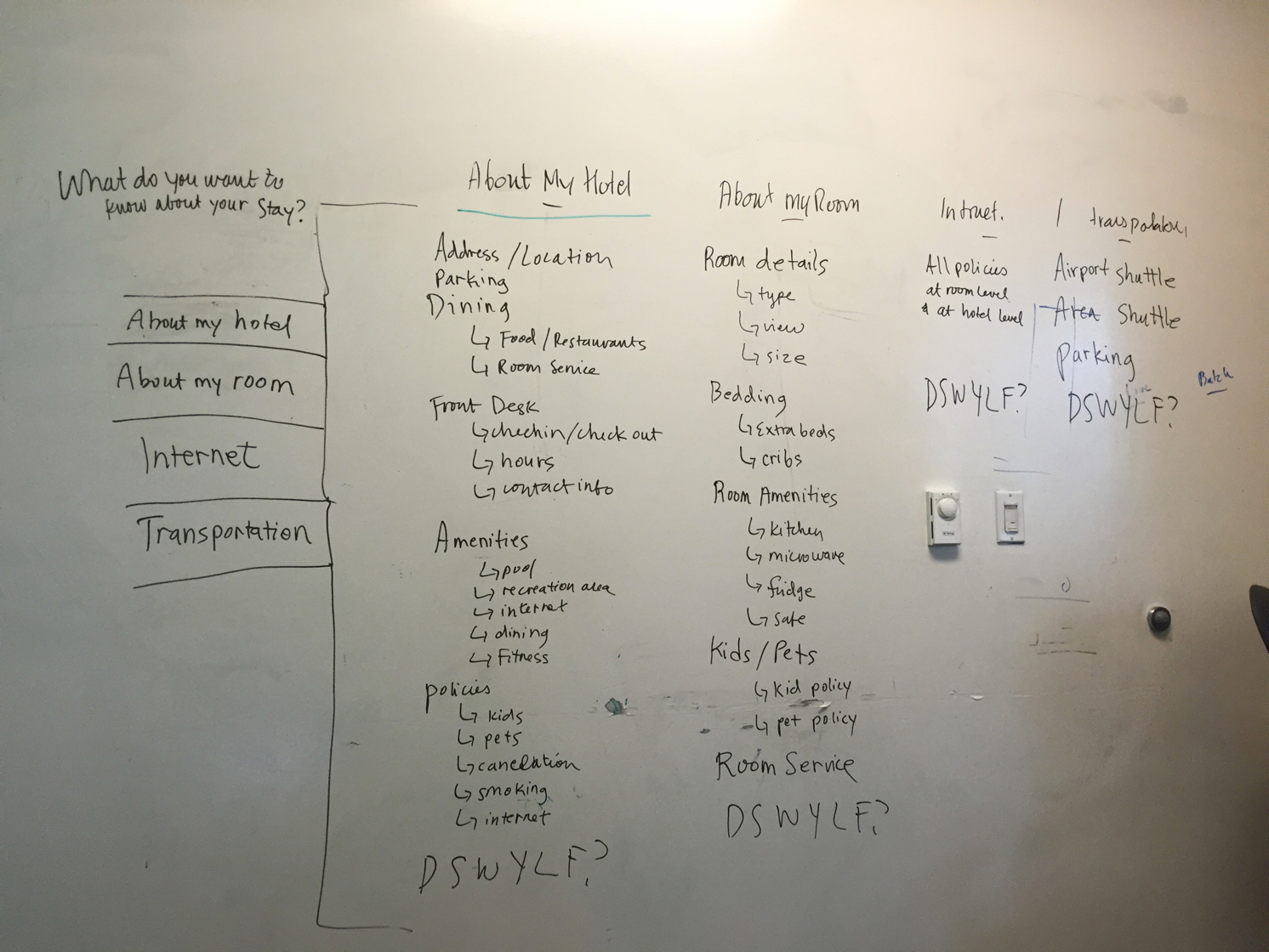
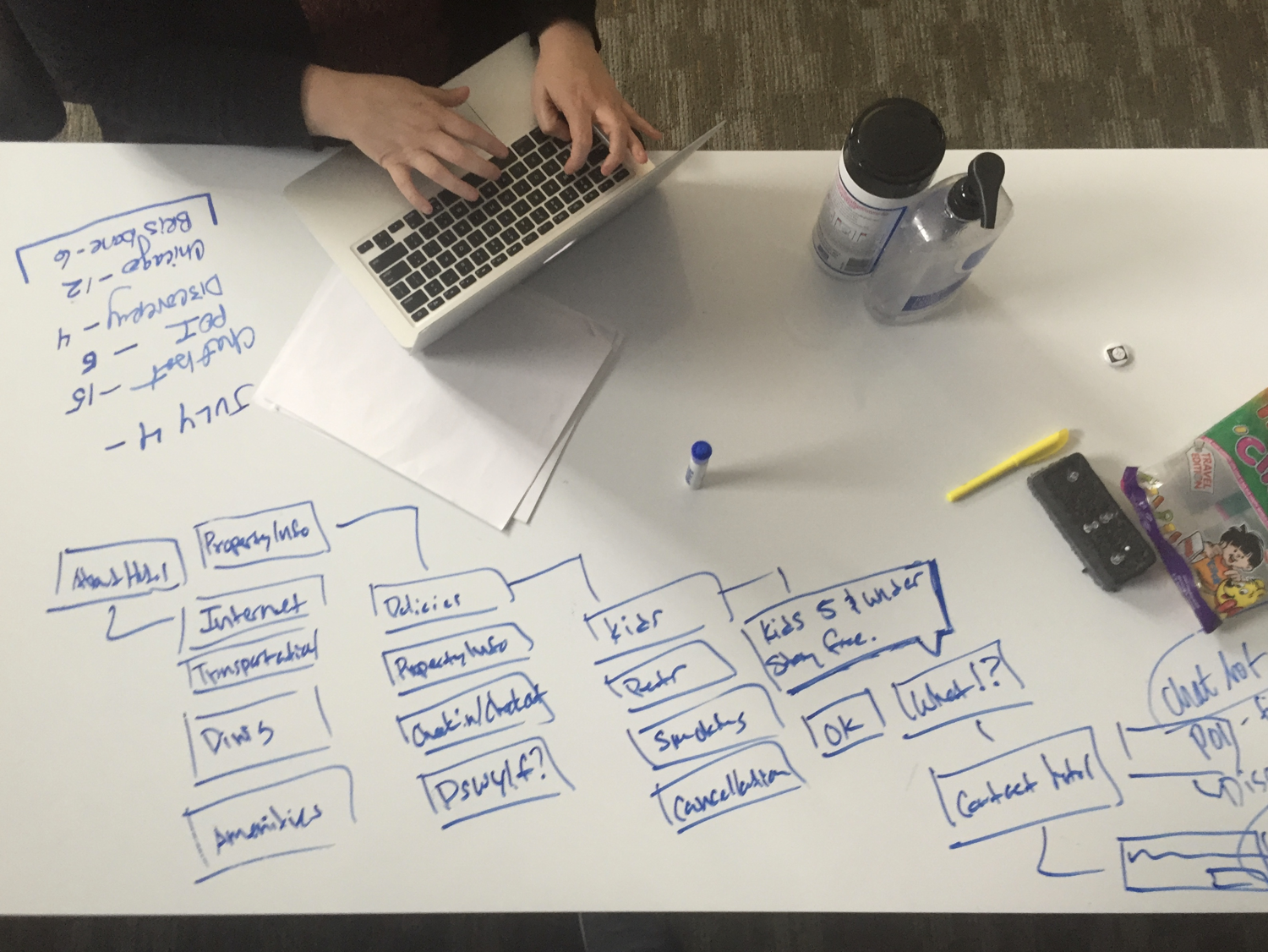
Utilizing the data to understand what questions were being asked and how frequently they were being asked, I sat down with our copywriter to define the decision tree. We created parent categories for the type of question and how it would be bucketed in the system and attached child questions to those categories.
Once the categories were determined we were able to start working on breaking the flow down for each question, building out relevant answers for those questions and determine where they would break – at this point, the traveler would have to message the hotel directly for an answer.
Research
The chatbot experience.
During the research and competitive analysis phase of this project, I looked at chat experiences that were already available on other popular websites and applications. I also attended an event in Seattle for Intercom, a popular customer service tool and chat experience to see what I could learn from those that were doing it well already.
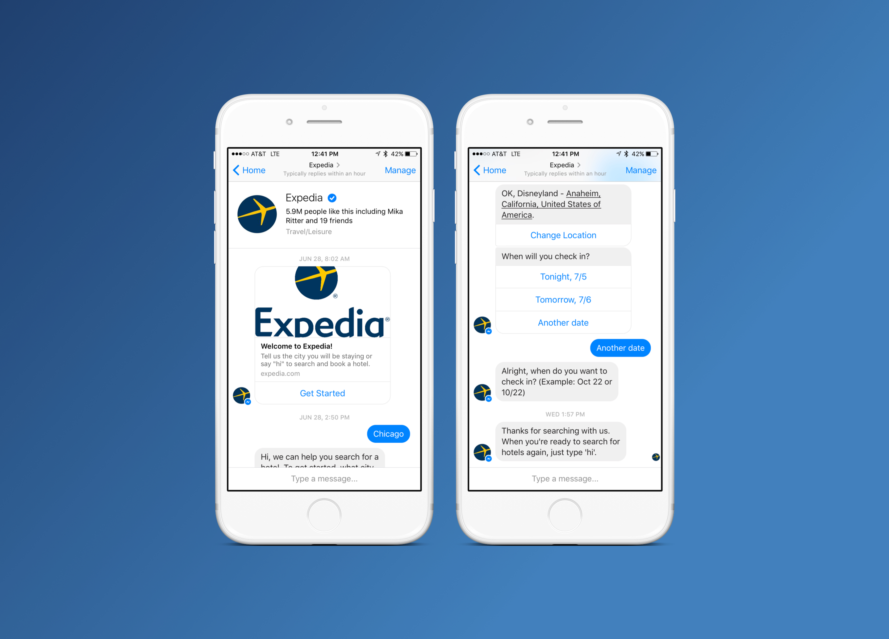
Facebook had recently launched their Messenger chatbot functionality and Expedia.com was part of that initial roll out. We looked to that experience to help provide direction for our chatbot feature, as well as to help create a cohesive chat experience for Expedia travelers.
Wireframes
Room questions and
property questions.
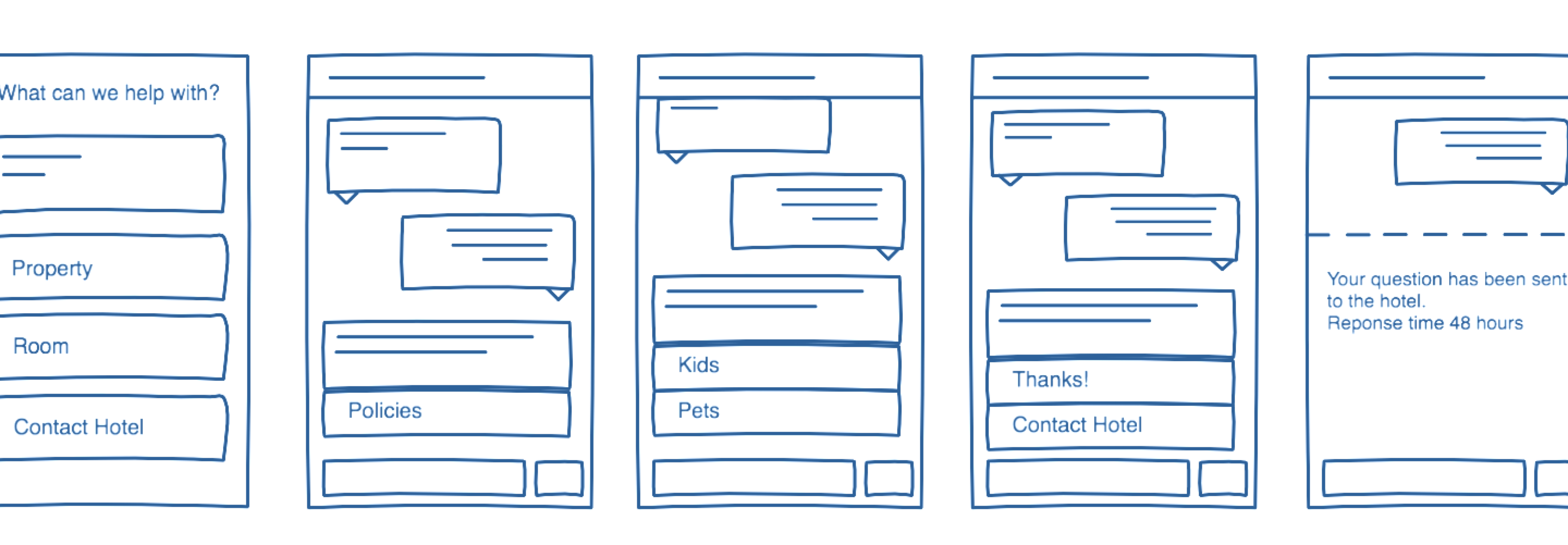
I love to whiteboard out my ideas and this project had one tricky aspect to it that I wanted to sketch out first before jumping into wireframes. We needed to figure out what the ingress point of a traveler's journey down the decision tree would be and how we would clearly differentiate questions about the hotel room and questions about the hotel property. I also spent some time roughing out the chat experience with the team on the whiteboard, before opening Sketch to make sure we were all on the same page.
Lo-Fi Prototype
Communicating the interactions & flow.
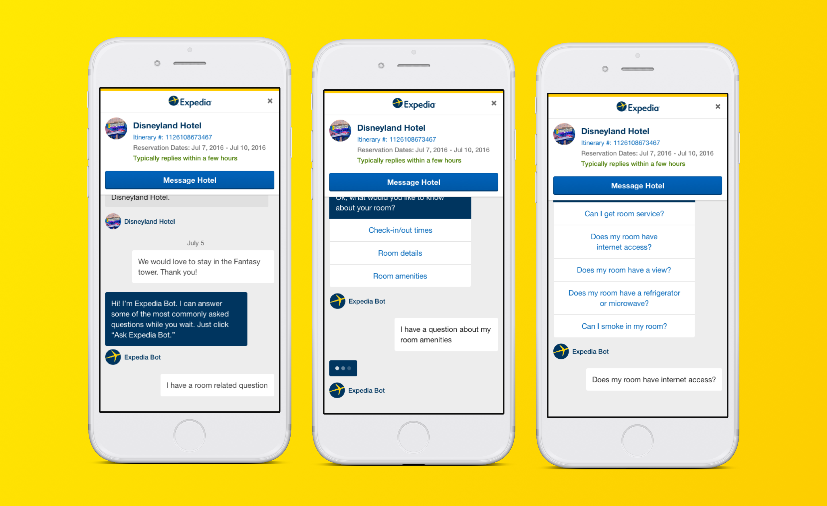
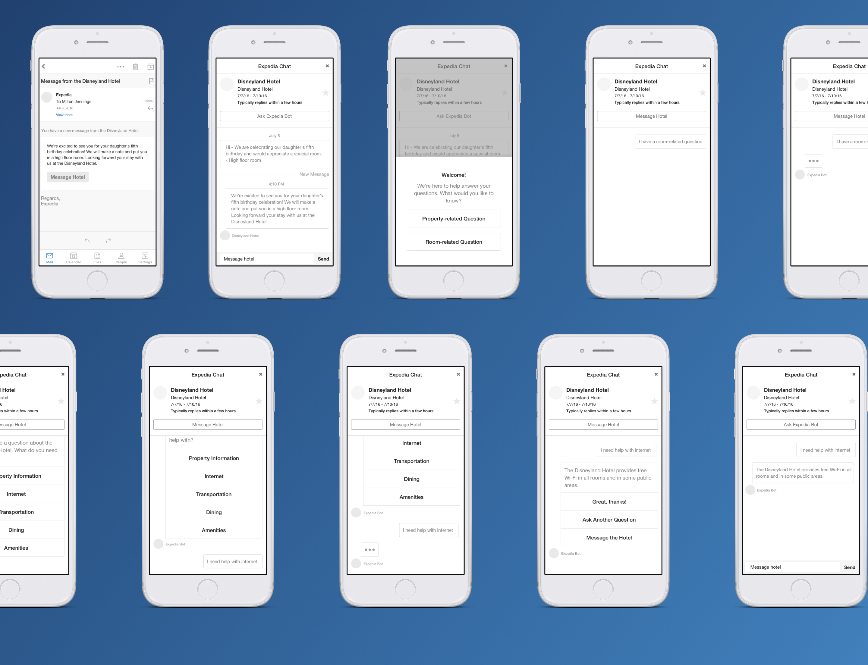
After doing some initial sketching, I jumped into Sketch and began wireframing out the interaction and flow for the chat experience. One of the key factors I wanted to keep in mind was this was a chatbot and not a chat window, so we wanted to make sure it was apparent to the traveler they were speaking to a bot and not directly with the hotel. I like to use real content and scenarios in my prototypes and designs in general, as people can get hung up on those details during a presentation or review – I've learned it's better to remove as many roadblocks as possible.
Visual Design
UI iterations to explore color treatments and develop white label design.
Once the wireframes were signed off on and the interactions were clear to the team, I began working on the UI design. Some key aspects I wanted to keep in mind were:
- Using color to differentiate who was talking in the chat window, as there was a possibility a traveler may be confused, especially if they had used the chat before for messaging directly with the hotel.
- Using brand colors to communicate with the traveler that they were on the chatbot platform through Expedia.com
- Keeping in mind that we would need to be able to share this design pattern across brands, so a white label version would be necessary.
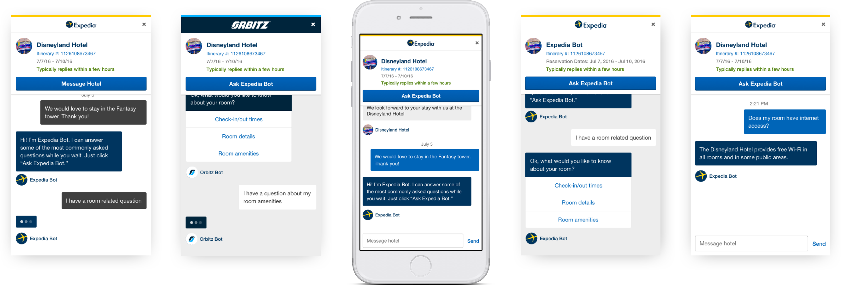
Hi-Fi Prototype
Interactive prototype to communicate final UI, interactions, and specs.
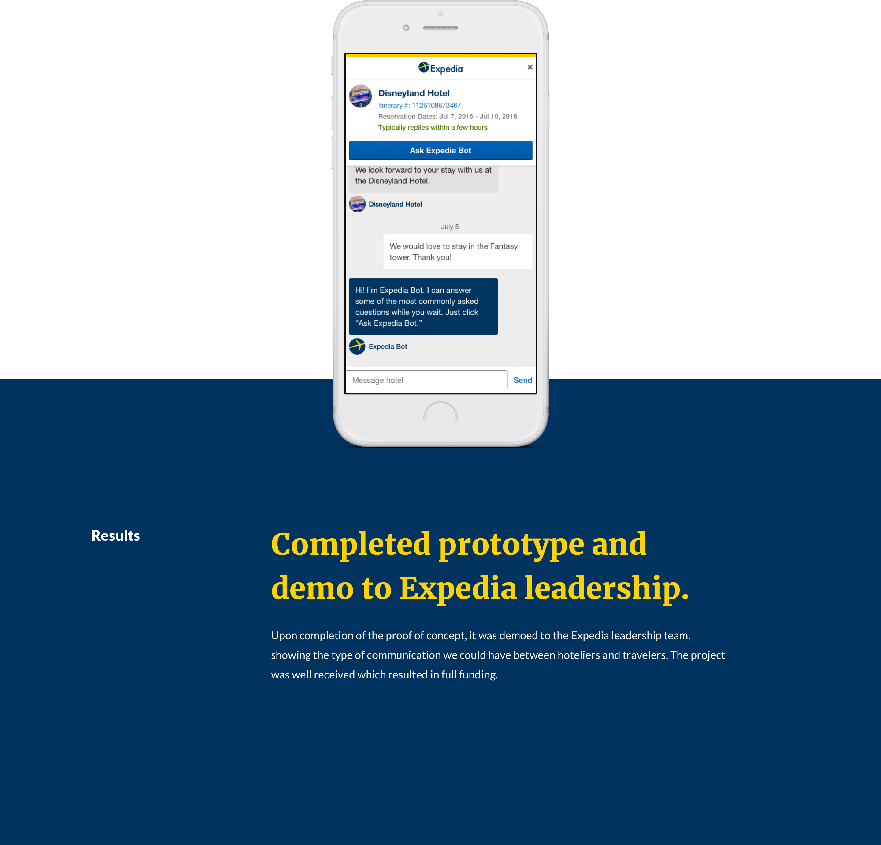
With the visual look and feel approved we moved on to the final part of this project, creating a high fidelity prototype and passing off final design specs through Zeplin. Zeplin is a great tool for handing off design specs but in conjunction with a continuous conversation with the developers on the project. I've found this is the best way to get work shipped that everyone is happy with.
