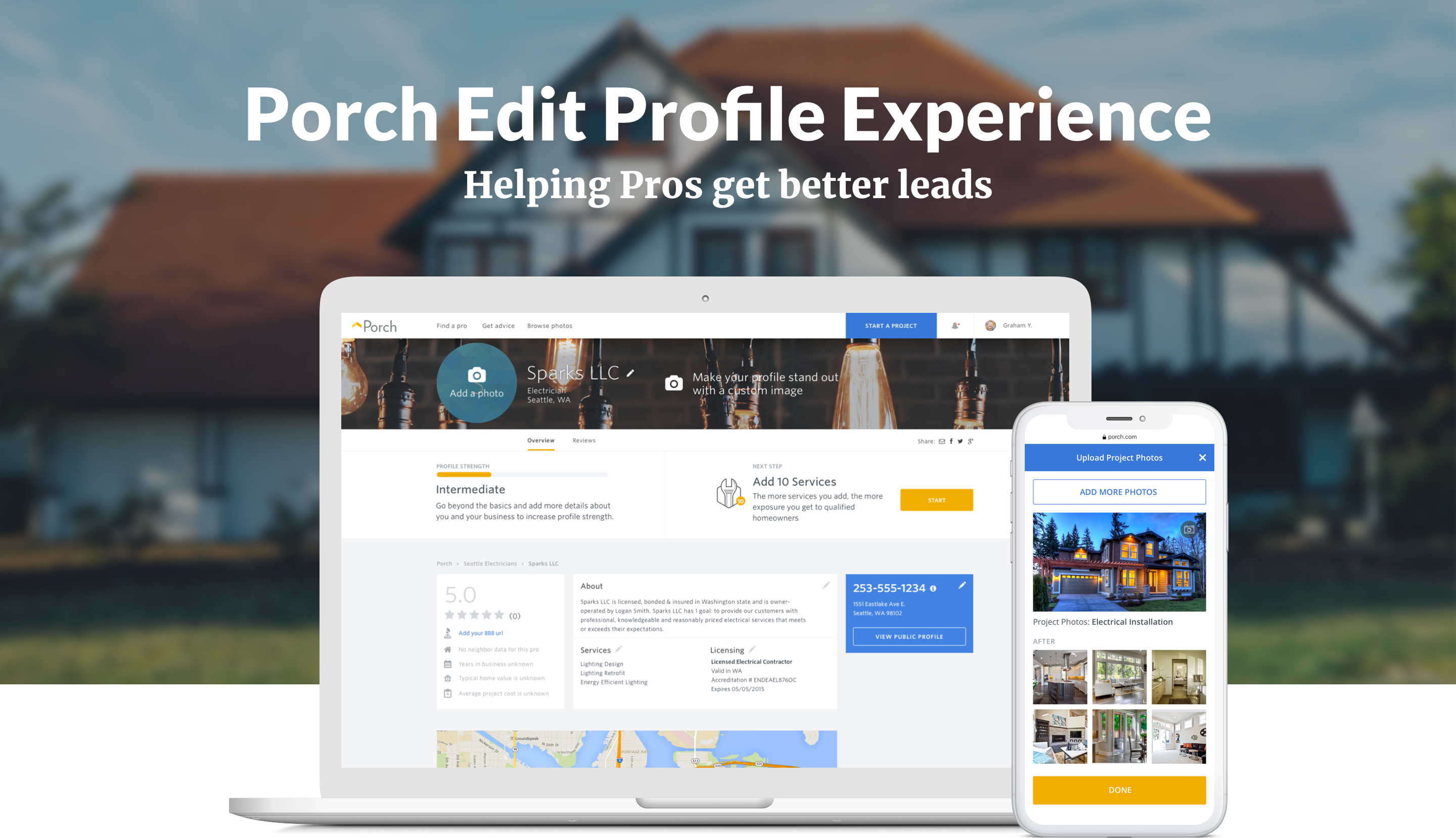
Overview
Project Date
Summer 2015
Role
Lead Designer
Responsibilities
Product Strategy
UX Design
UI Design
Prototyping
Connecting professionals with qualified homeowners, looking to get work done.
Porch is a company that is building a web platform to help home services professionals connect with homeowners that are looking for help with a project they want to complete. Every day they connect professionals with qualified homeowners looking to get work done, by providing quality leads and communication tools that will help them land the job.
One tool that is used is the Porch Pro Profile.
Pros don't understand the time investment with completing their profile and the correlation between the advancement of their business growth on the platform through better placement in search results.
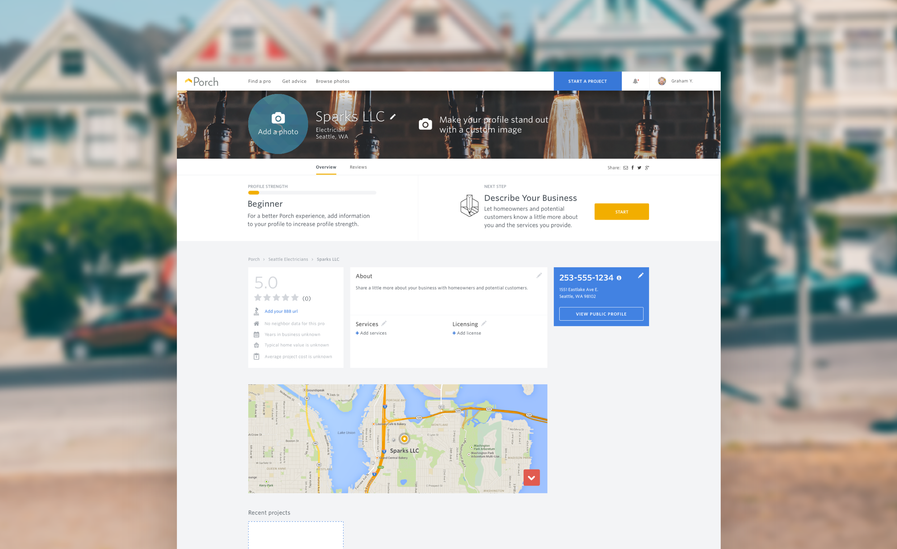
To help Pros better understand the value of completing their profile on Porch, we wanted to redesign the Porch profile experience to communicate the value better and educate Pros on what is needed to gain the qualified leads they are looking to receive.
Defining Goals
Talking with and listening to professionals.
To kick this project off, I worked with my Product manager and engineering team to build out the scope for the project and define the strategy of the redesign. We began by looking over the feedback and data we had received from talking to our professionals, to understand why this was a problem and how it was affecting them.
We found that professionals were receiving poor leads and were not able to see themselves easily when searching on Porch.com. By looking at the data, we saw that Pros that had taken the time to complete their profile were receiving better leads than those that had an unfinished profile.
We analyzed the essential elements that needed to be completed on a profile and found
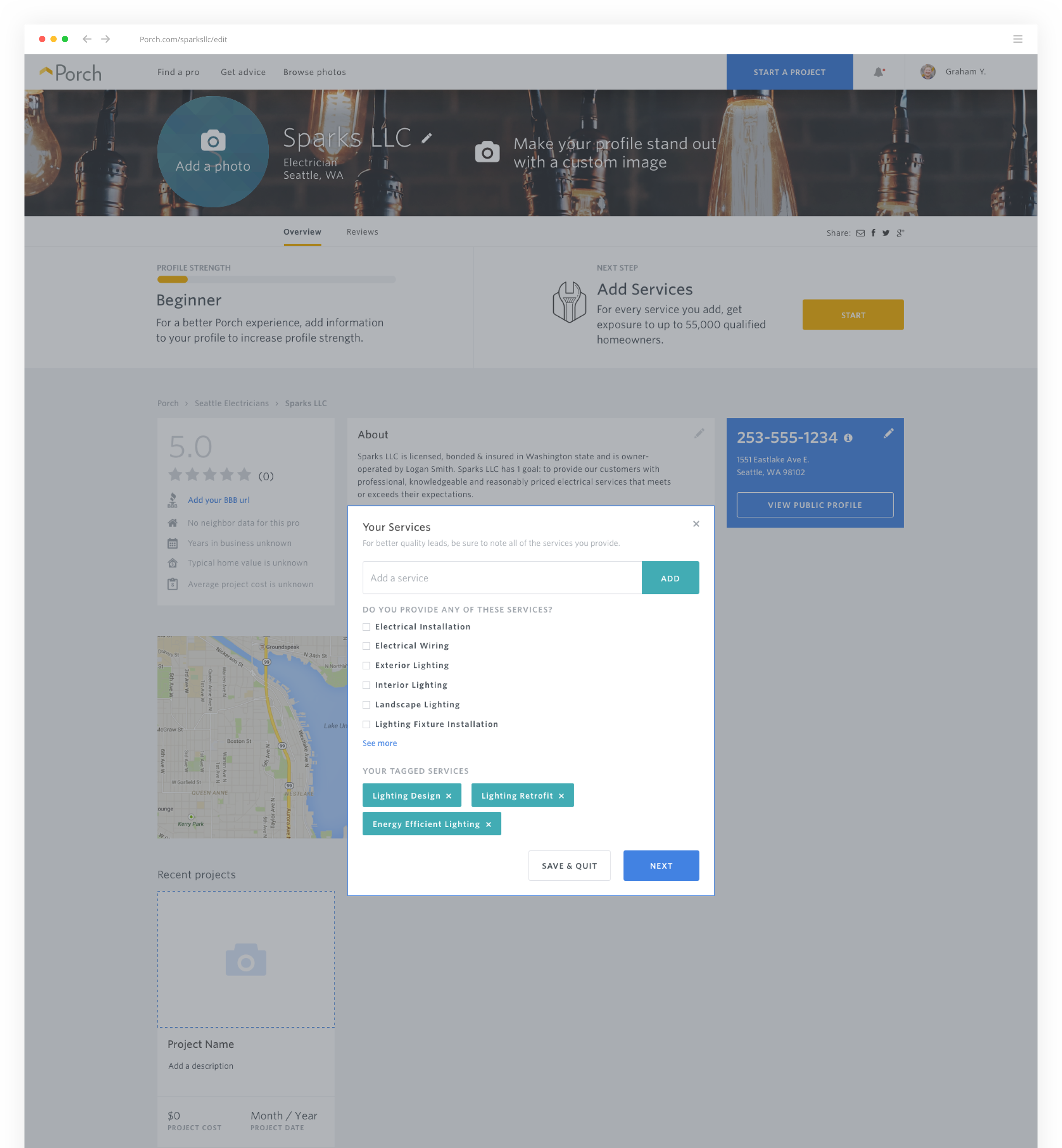
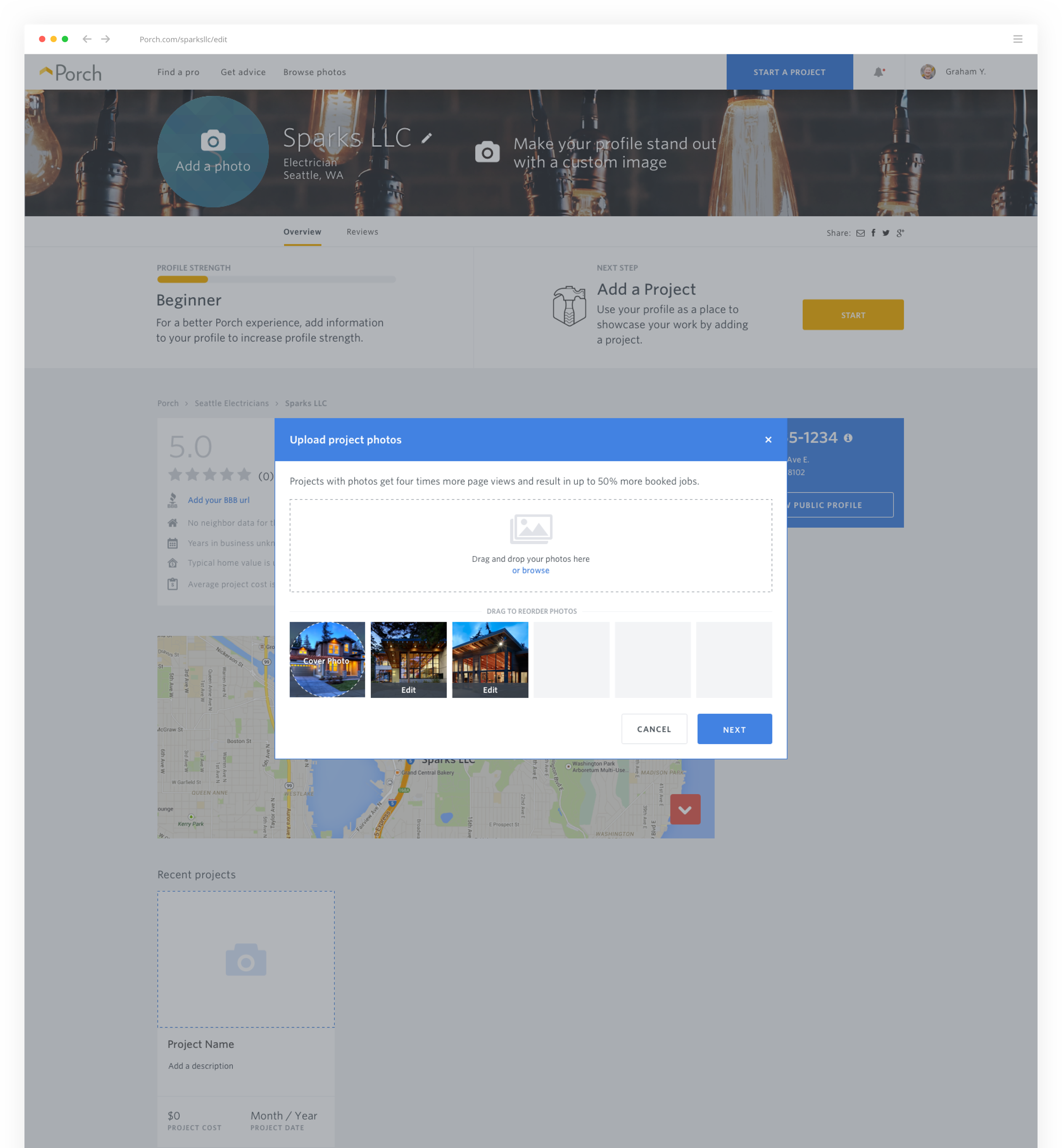
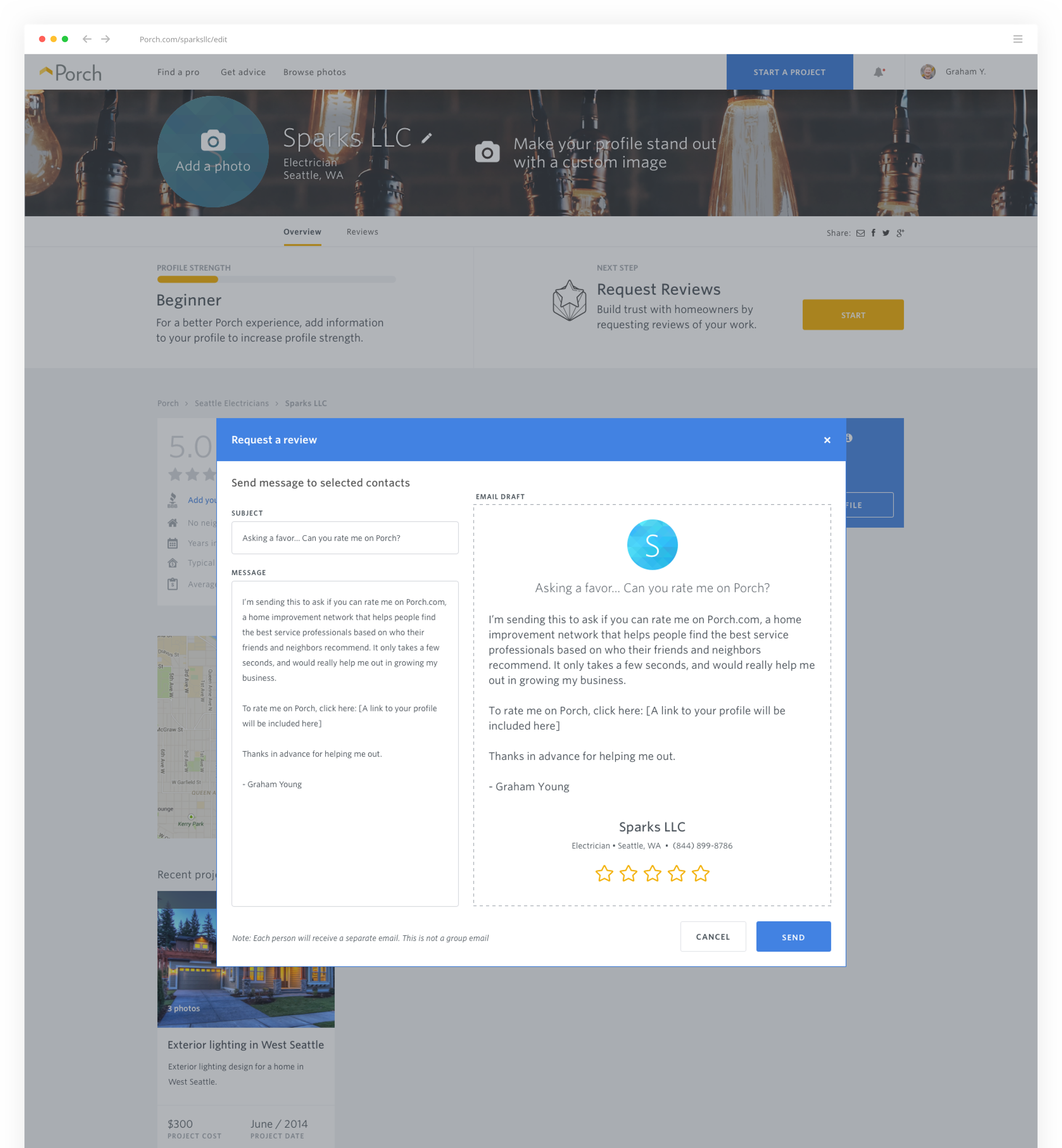
Pros that added a profile photo, wrote about their company, added the services they provide, uploaded a finished project and had reviews on that project received higher quality leads.
Doing this analysis allowed us to understand the problem, how best to tackle it and establish goals for the new experience. We also learned exactly what a professional needed to fill out to make the vetting process easier for homeowners.
Our goals for the redesign were:
- Improve the Pro onboarding experience
- Create a unified Pro and Homeowner profile view.
- Define what a complete profile looks like and establish those requirements.
- Educate Pros on how to complete their profile and how it will benefit them and their business.

Sketches
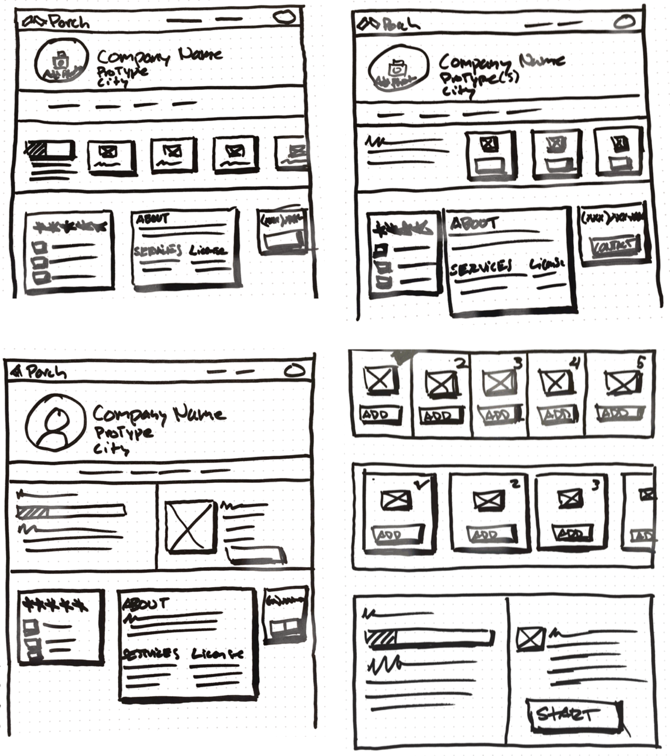
Whiteboarding to quickly explore ideas and iterations.
With our goals defined I started doing some market competitive analysis, as well as out of market analysis of companies that had an edit profile experience to learn who was doing it well, who wasn't and what the best practices might be.
Once I was aware of commonalities and best practices of successful profile creation experiences, I started whiteboarding out some ideas and concepts for rapid iteration and exploration. I used these sketches to communicate with my Product Manager and Lead developer what I was thinking and align with a direction before moving into visual exploration and hi-fidelity comps.
UI Design
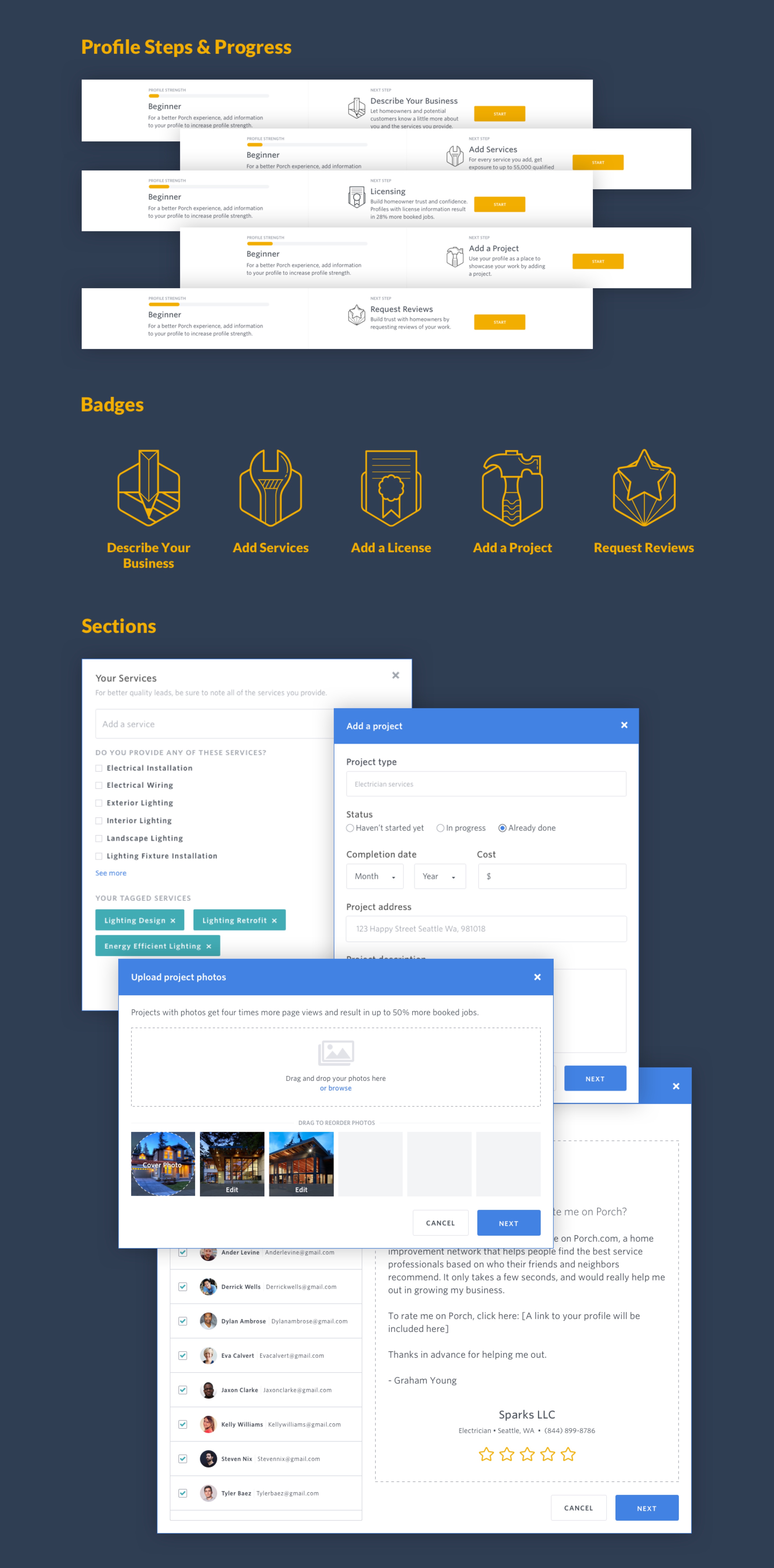
Visual explorations of color, motion and card styles.
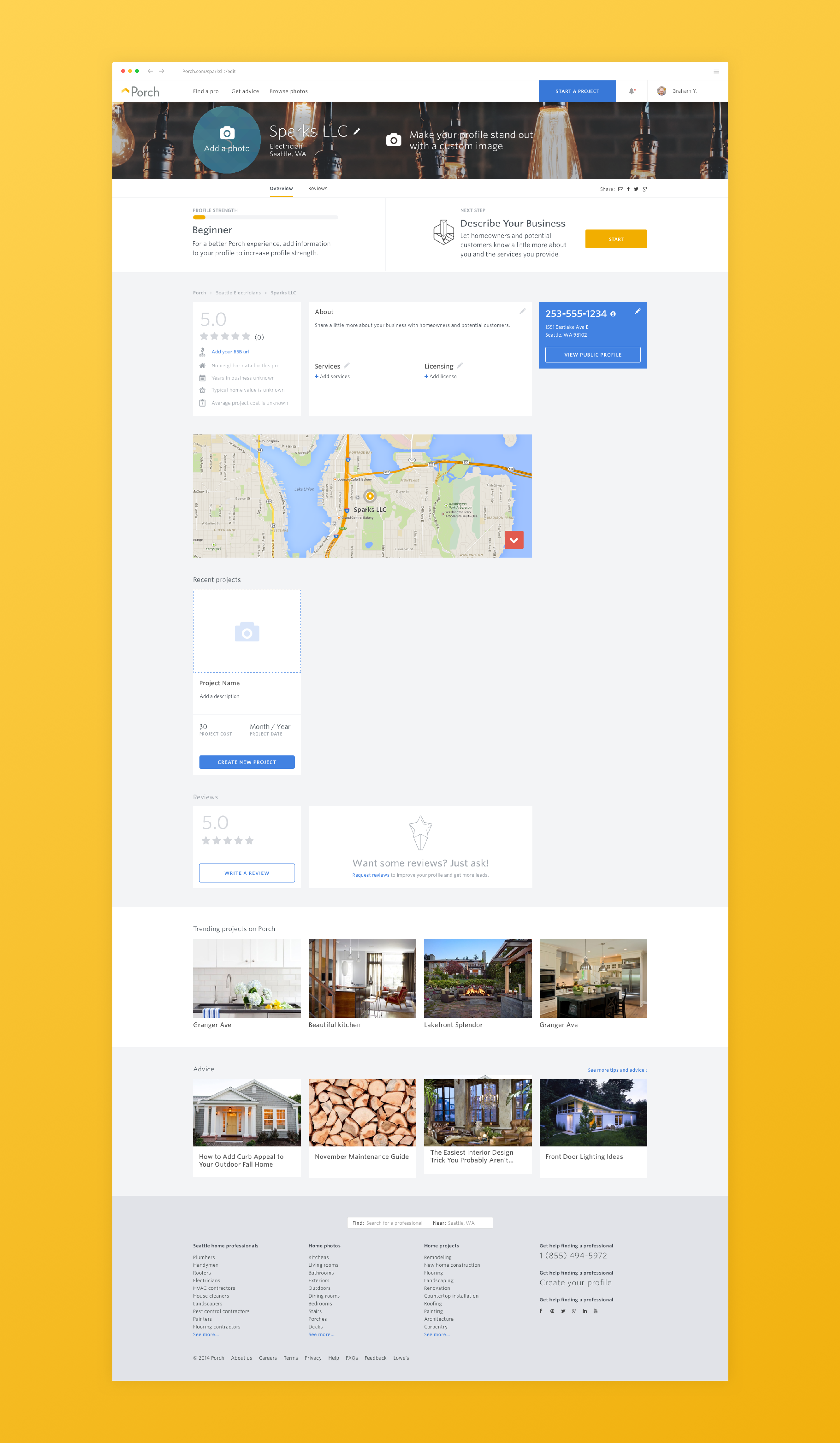
With the direction agreed upon, I started working in Sketch building out screens for how this experience would work and what it could feel like. During this part of the process, I explored how we could use color in this experience in a way that was unique to the Pro edit state.
User Testing
Feedback on the new experience from Pros.
Once we had reviewed the designs with our CEO, I was able to get sign off on the direction and move into user testing. This was exciting because user testing was something Porch as a company had never really done before, especially with professionals.
I set up our user testing account and proceeded to write the tasks and questions that we wanted the participants to complete. We ran 7 participants through the interactive prototype I had built in InVision, asking them to complete the onboarding and profile setup for Sparks LLC, the proxy company we were using.
In person testing with professionals.
I also had the opportunity to work with our new UX researcher, who was brought on for another project, to invite Pros into the office and have them run through the unique experience in person and give us feedback.
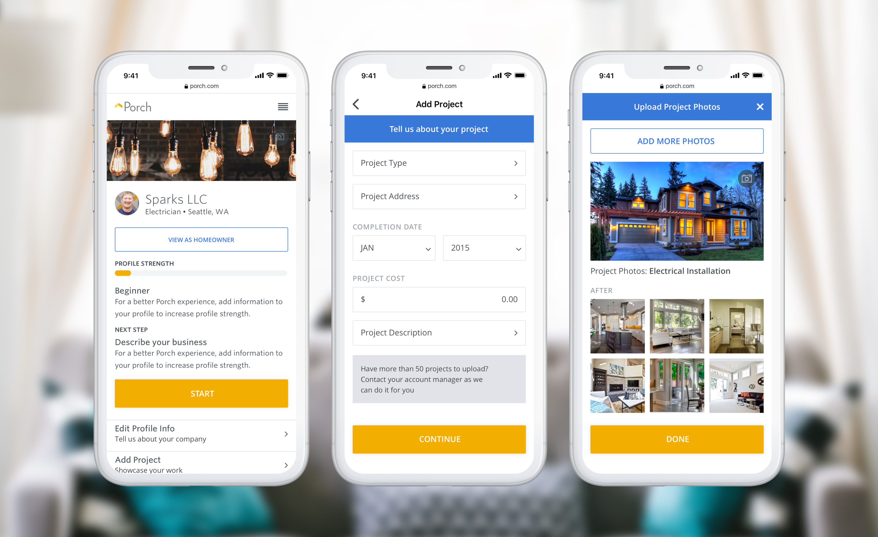
Results
Shipping the new edit experience for Pros.
Taking into consideration the feedback received from our testing sessions and the overall positive response to the new experience, we decided to move forward and implement the new edit profile experience. Porch, unfortunately, went through a pivot in the Fall of 2015, resulting in layoffs and I never got to see this project through to fruition.