Overview
Project Date
Summer 2019 -
Fall 2020
Role
Lead Designer
Responsibilities
Product Strategy
User Research
UX Design
UI Design
Prototyping
Overview
Project Date
Summer 2019 -
Fall 2020
Role
Lead Designer
Responsibilities
Product Strategy
User Research
UX Design
UI Design
Prototyping
Helping landlords communicate they're ready to move forward with an applicant
Helping landlords communicate when an applicant is selected
Landlords want to communicate to prospective renters that their application has been selected and that she wants to move forward in the process of securing them as tenants.
Today, landlords solve this problem by calling, texting, or emailing selected applicants to relay the news and discuss the next steps. To streamline this step and make it more efficient, Zillow Rental applications created the functionality to communicate this digitally through our applications platform with the "Accept" functionality. Unfortunately, we weren't seeing this feature's adoption that we would like to see and wanted to find out why?
User
Research
User Research
Defining what isn’t working with Application “Accept”
Defining what isn’t working with Application “Accept”
Through our Principal Product manager's efforts doing in-product analysis and partnering with our UX researcher to run a study on the current experience, we were able to learn what wasn't working.
Through our Principal Product manager's efforts doing in-product analysis, we were able to see the types of messages that landlords were sending to prospective renters. We learned that landlords were sending various messages to applicants, indicating that landlords weren’t clear on how to use the Zillow Application accept feature.
With this hypothesis, we kicked off research to dig in to understand the pain points and blockers for landlords in the current accept application experience.
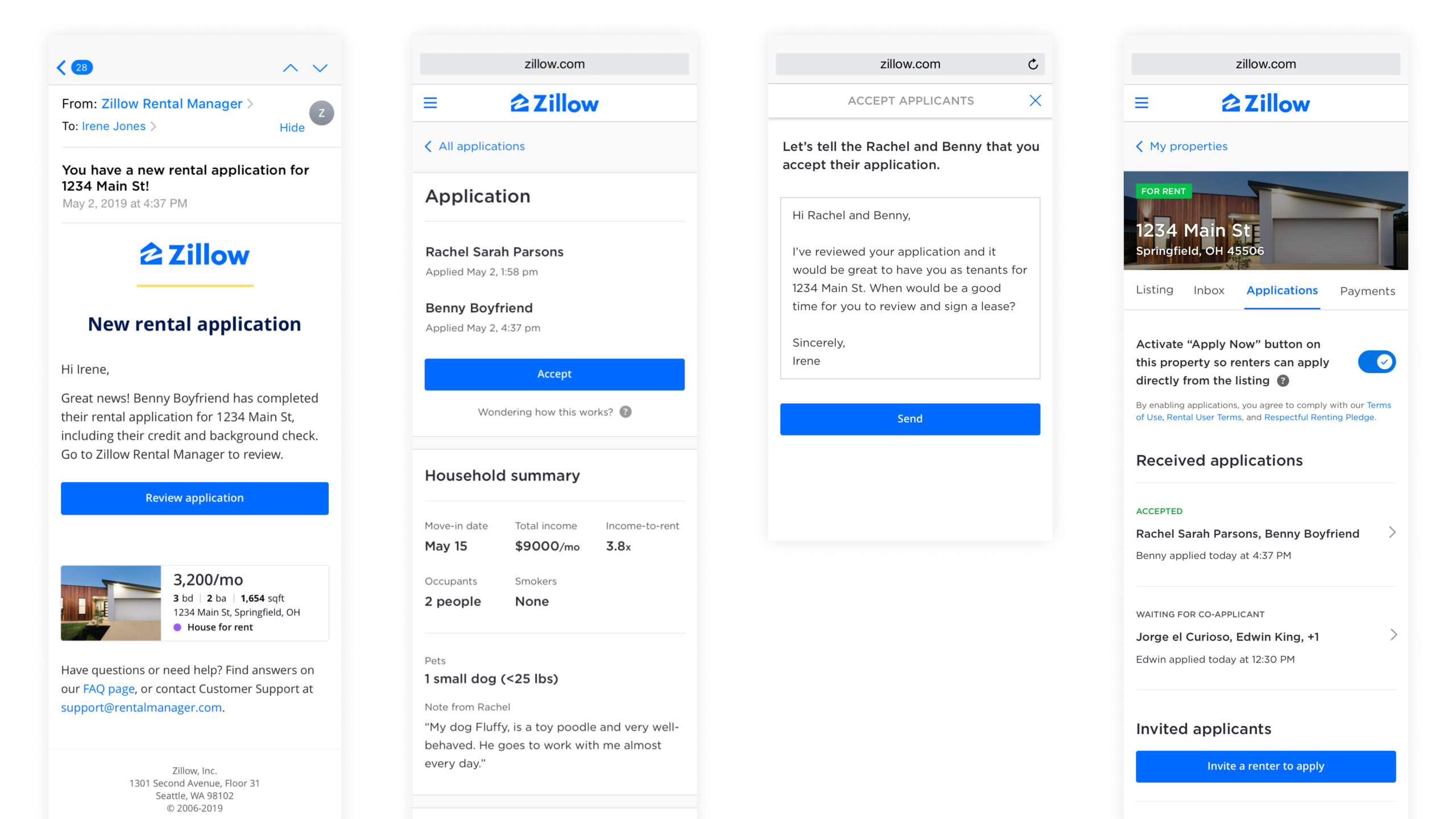
Research Insights
Research Insights
After attending the sessions and synthesizing the research, we learned
After attending the sessions and synthesizing the research, we learned
Landlords were unsure of what “Accept meant
None of the participants naturally engaged with this feature within the user test, implying discoverability and comprehension challenges.
When prompted, participants thought that this feature was one of two things:
- A read receipt acknowledging that the application was received and it was being reviewed.
- You had received the application, and you wanted this applicant to move into your rental.
Comprehension aids were far away from the feature
The help icon for aiding in comprehension is located too far away from the “Accept” button. As a result, when people struggle to understand what the “Accept” button does, they may not associate the help icon with the “Accept” button.
The button is not contextually relevant at this stage
Landlords typically accept applicants upon reviewing the entirety of the Application and after reviewing several Applicants. As a result, the current button placement feels awkward as it doesn’t follow this process.
The copy is unclear
The copy being used is unclear, and what it means to “update application status to accepted” is not understood. It does not provide landlords with clear action items for what to do next (if anything) within the process of accepting this applicant.

Defining Goals
Defining Goals
To increase the usage of the application “Accept feature
To increase the usage of the application “Accept feature
Improve the utility and let people know what they’re getting
We need to improve the usefulness and value of the feature and make sure people can easily understand what they’re getting from using this feature to accept an application.
Help landlords close the loop
No one likes delivering bad news. We need to provide a way for landlords to update all prospective tenants regardless of whether they have been accepted or not.
Consider where this action is contextually relevant
We need to understand a landlord's mental model for accepting an application and put the button to initiate that action in a contextually relevant place on the page.
Celebrate the moment
We need to provide a way for landlords to notify applicants of their acceptance and this milestone moment of the applicant in their journey to secure this rental.
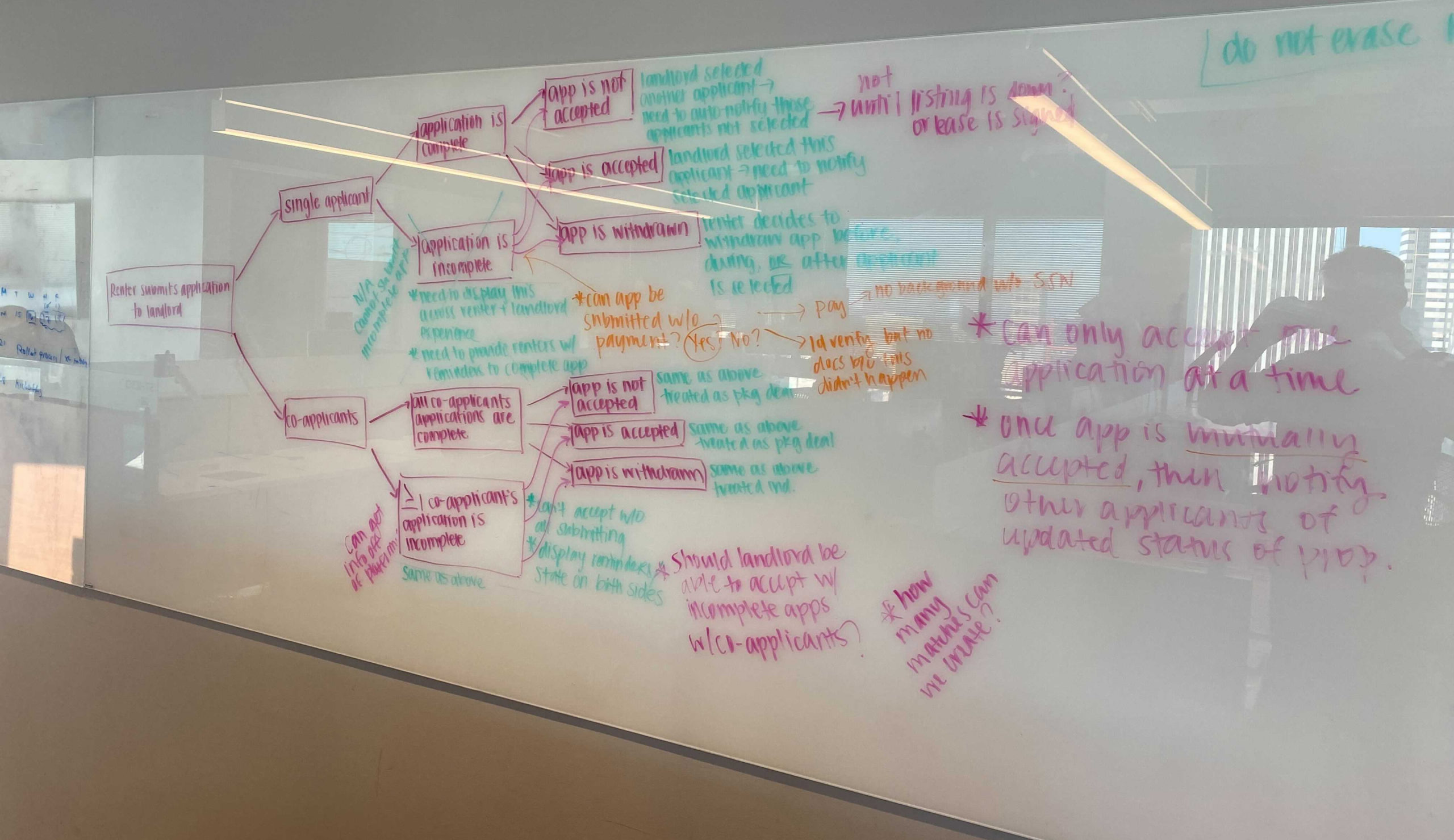
Early Exploration
Early Exploration
Competitive analysis and
early explorations
Competitive analysis and early explorations
With our goals defined, I started doing some competitive analysis of companies with similar communication experiences to learn who was doing it well, who wasn't, and what the best practices might be.
Once I was aware of commonalities and best practices of successful communication platforms, I started whiteboarding out some ideas wireframing concepts for rapid iteration and exploration. I used these sketches and wireframes to communicate with my Product Manager and Lead developer what I thought and align with a direction before moving into wireframes.
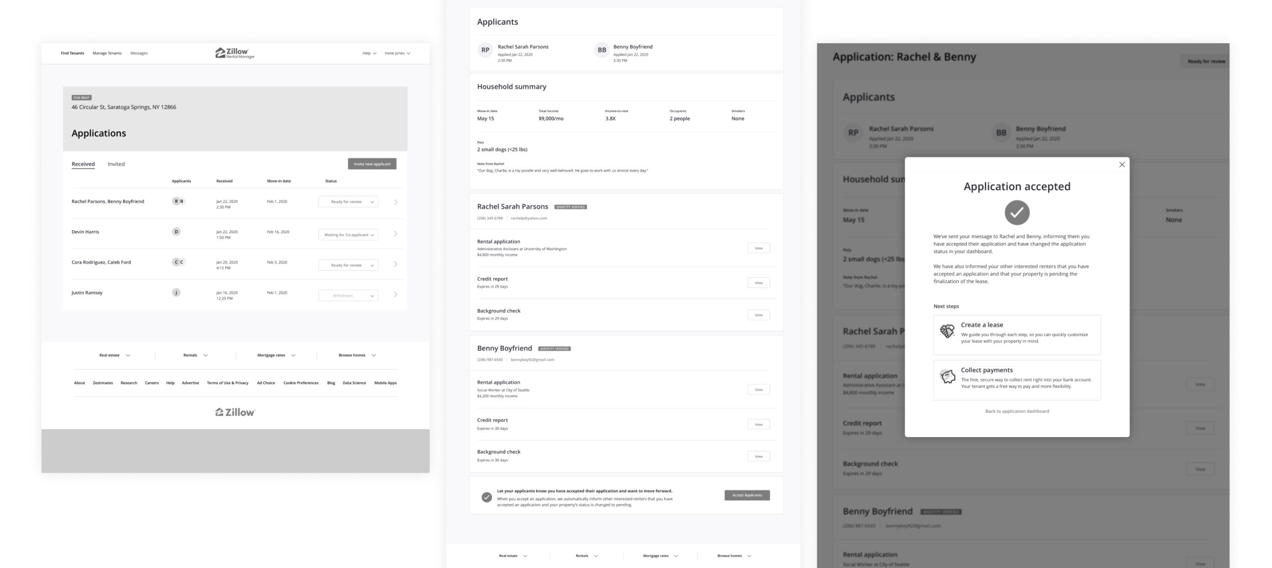
Wireframes Revised
Wireframes Revised
The user goal of the application summary page wasn't clear
The user goal of the application summary page wasn't clear
After sketching out some quick concepts, I jumped into wireframing out the accept application experience improvements. While working within the design and layout of the existing application experience, a new challenge became apparent. There was too much information on this page, making it unclear what the goal was.
After discussing this with my Product Manager, we decided that we would need to define the goal of the page and expand the scope to restructure for this feature to be successful.
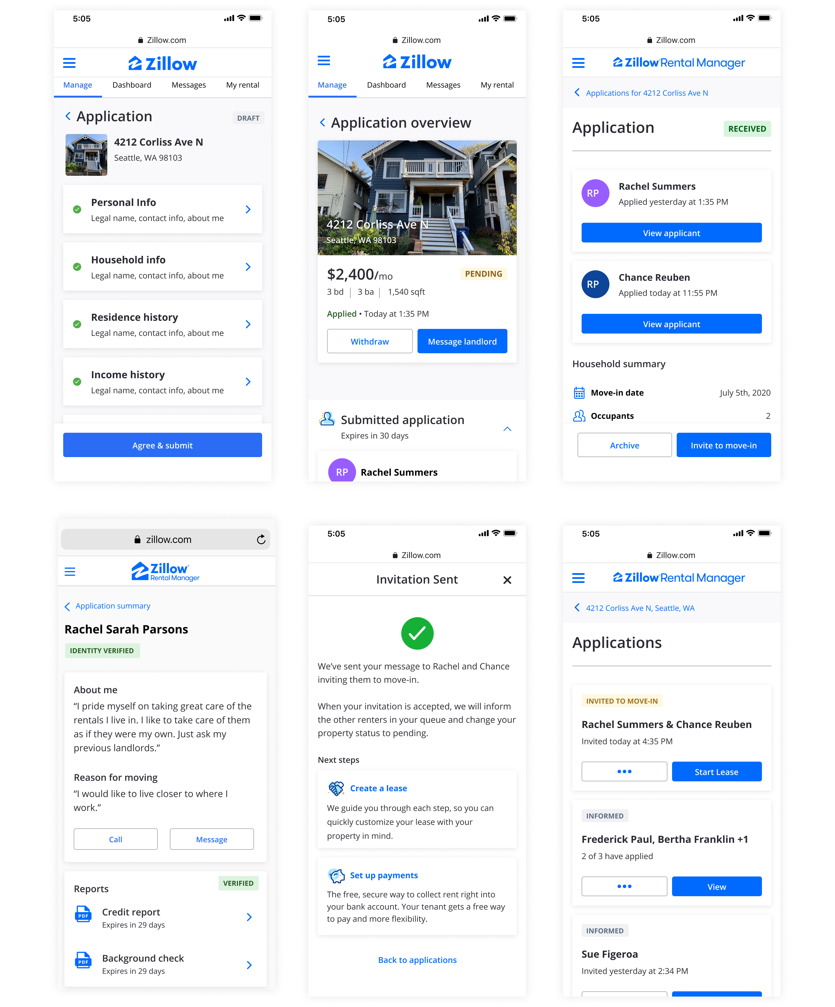
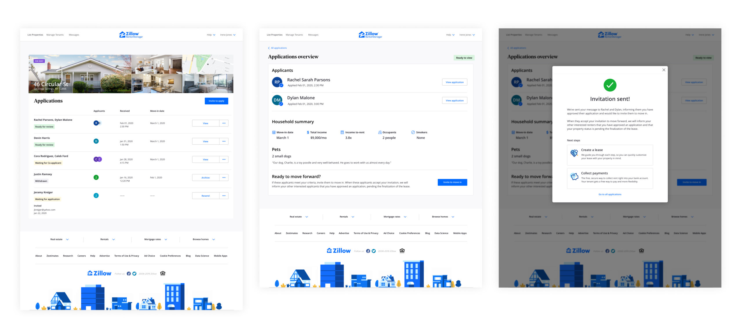
We decided that the page's goal would be to decide whether you wanted to accept these applicants. To communicate this effectively, we restructured the page, so the primary focus was helping a landlord make that decision by removing the applicant's details and providing a clear entry point to each applicant's personal application.
I also worked with our content strategist to develop clearer language to what was actually occurring when you “Accepted” these applicants. We decided that this action was more of an invitation to an applicant indicating that their application had been accepted and that they were being invited to move in. So we agreed to change it to “Invite to move in.”
Lastly, there was a desire to drive awareness of Zillow’s other rental tools and help a landlord know what to do next on the platform after sending an invitation to the applicant. To help with the connection, I added entry points to the success modal to help communicate a landlord's next step and the tools we offer.
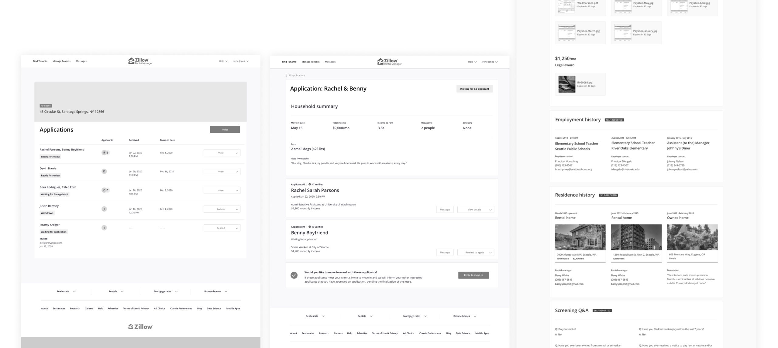
User Research Part 2
User Research Part 2
Testing the redesign to see if we accomplished our goals
Testing the redesign to see if we accomplished our goals
Once we were aligned on the page's structure and the additional elements added to the experience, I mocked up a high-fidelity prototype to get feedback on the changes we had made. At the time, the rentals researcher was unavailable to run this study, so I met with her to review my study plan and ran the study myself by using unmoderated sessions through Usertesting.com.
After watching the sessions and synthesizing the notes, we learned:
The dashboard is useful and understood
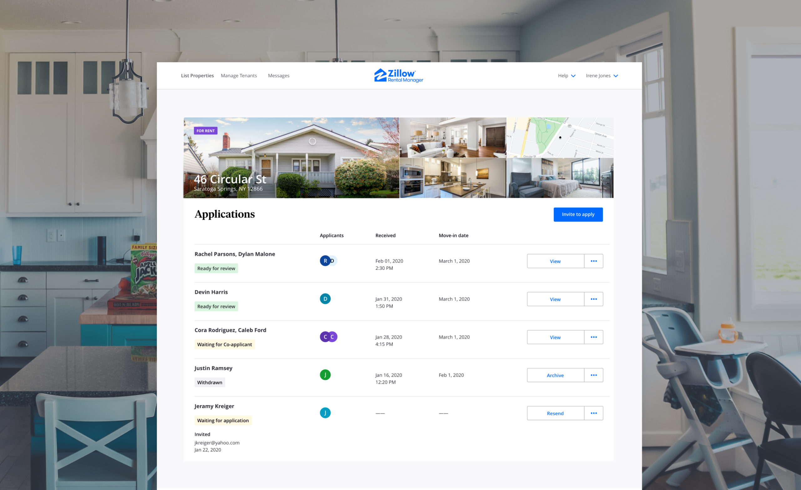
The application’s dashboard statuses were clear and helped a landlord understand what was happening with each applicant at a glance. Participants also understood the actions that they could take.
Application summary has a clear purpose
Participants understood the purpose of the application summary page as a place to decide if they wanted to accept and applicant. They also understood what “Invite to move in” meant and what would happen if they clicked the button.
The next steps are clear
The “Invitation success modal” successfully communicated that an invitation had been sent and the next steps available to a landlord. Most were excited to learn that they could do the entirety of their process through the Zillow Rental platform.
High-fidelity Design
High-fidelity Design
Designing for both the landlord
and renter experience
Designing for both the landlord and renter experience
Zillow Rentals is a dual-sided marketplace. Now that the landlord initial design was complete, I wanted to start considering how the landlord and renter experience would connect and how the act of inviting a renter to move in would show up in the renter experience.
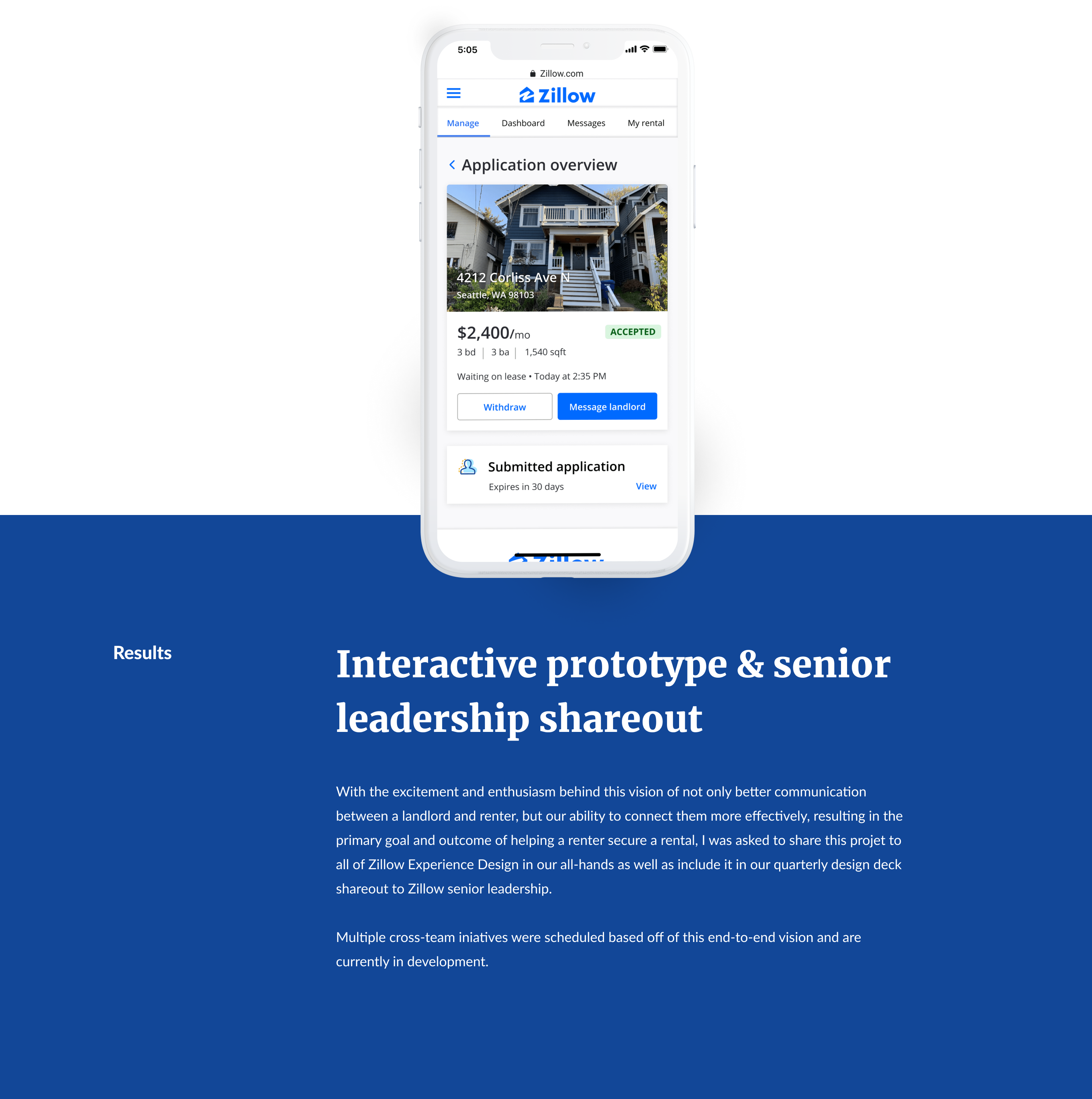
As I was working on this end-to-end design, I also had meetings with other Zillow Rentals stakeholders and leadership to show off the vision for this experience and get their feedback on the designs. This helped drive alignment and cross-team planning.
